Is health the trend of 2021?
11 minuter
Översättning saknas
Is health the trend of 2021?
It's that time of the year again. Trends are presented, discussed and shared. It’s exciting and a new year can do that to us. This is my perspective on the trends 2021 and over the years.
Thinking back on the beginning of my professional career, I remember when Web 2.0 was on the horizon and the blog articles were swarming the internet. It left an impression on me and since then I've been following the announcements of trends, looking at all the available examples. Googling ways of working, collecting downloads and learning how to create new web trends from tutorials, and the alike. Compared to then, the trends I look for today are more about UX than UI and should be based on the customer experience and not necessarily only on UI tutorials for designers on how to make a button in i.e. Photoshop. This is a great thing! So where are the trends going this year? Here's my take on it.
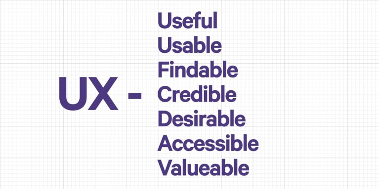
Health, moving forward
Health is a trend, and it's not going away. With a year of isolation behind us and a year of behavioral changes in the marketplace, I believe this year will be all about convenience and how to approach a change of well being. It's all about finding the ideas to make the new health landscape work.
There are a lot of health apps out there. For example, I've been using a mobility app called GoWod for about 6 months and they recently updated the interface. Not a major redesign, but enough to understand that they have listened to the users. That kind of improvement is exactly what you want to see as a customer or end-user this year. The health market needs user data to make a difference. For example, the biggest issue I've had with the mobility app up until now, is the automation when switching between exercises in my personalised stretch program. That's now updated and works better than before. Now there's a voice reminder of when an exercise is about to finish as well. Great update!
We, as users, don't need to have everything changed. We look for small improvements that make tasks easier and more efficient. That's a trend I can stand by. We don't have to be blown away each time there is an update. Keep it simple and make improvements to what's already great.
Community and influence
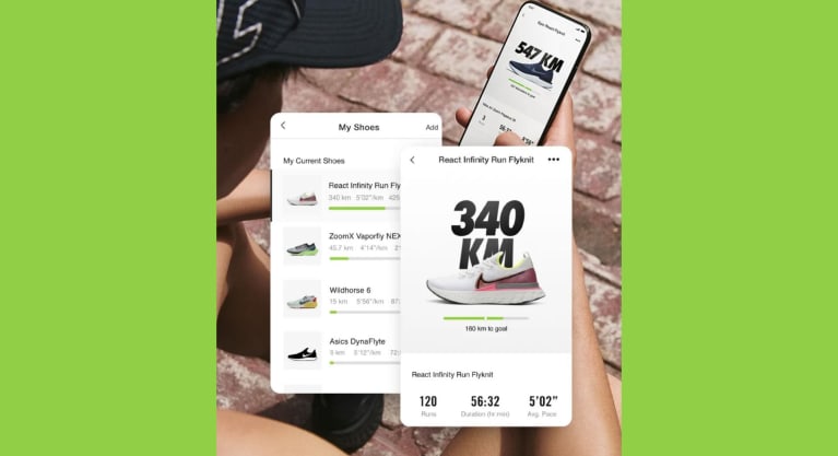
So how do we keep moving? How do we get the right amount of influence and get pushed just the right amount to get to a better and healthier life? As a UX designer I find the biggest challenge in this area is to get people keep coming back. A gym owner would say "It is easy to get a person to come to the gym once. Its a success if they come twice." It has to be easy to return. Also, a community that can get behind you is a must. Do it together with others with the same type of goals. Nike Run Club and Strava are great examples of communities that offer positive support and help us reach our goals and find friends. Nike has been around for quite a while and they follow the tech improvements. They teamed up with Tom Tom early on and now with Apple and have their own Apple watch. Again, a company has kept a concept and made changes for the user and where the user is and want to be.
So 2021, what will you bring? Health is on everybody's mind. We want to stay safe and we want to be a part of something more than just staying at home. Get out there and ask questions, find out what people are doing to keep going and ask what they are missing. The trend(s) of 2021 according to me, is a simpler way of life by listening more to others and setting reachable goals.
In retrospect
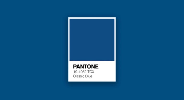
I want to share the one thing I always follow and look forward to. The Pantone release of color(s) for every new year sets a great tone (pun intended).
For 2020, it was Pantone 19-4052 Classic Blue.
“Instilling calm, confidence, and connection, this enduring blue hue highlights our desire for a dependable and stable foundation on which to build as we cross the threshold into a new era.” - Pantone.com
They go on:
“Imprinted in our psyches as a restful color, PANTONE 19-4052 Classic Blue brings a sense of peace and tranquility to the human spirit, offering refuge. Aiding concentration and bringing laser like clarity, PANTONE 19-4052 Classic Blue re-centers our thoughts. A reflective blue tone, Classic Blue fosters resilience. As technology continues to race ahead of the human ability to process it all, it is easy to understand why we gravitate to colors that are honest and offer the promise of protection. Non-aggressive and easily relatable, the trusted PANTONE 19-4052 Classic Blue lends itself to relaxed interaction. Associated with the return of another day, this universal favourite is comfortably embraced."
The Pantone Color of The Year is the one trend I can always use with everything that I do and produce. I can learn from it, get inspired from it and the color(s) influence me in every medium that I work in. Also, just like that, last year’s color is now the stepping stone to the new. Like always. Like it should be.
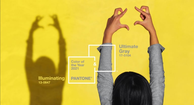
Pantone 17-5104 Ultimate Gray + Pantone 13-0647 Illuminating are the colors of 2021
Let's see where they take me...
PS - Side note:
Before I leave you, I'd like to adress something that can bother me from time to time, and I think is inevitable for making the right decisions when working with end-users and eager customers.
We all are the product of what once was trendy or top notch. We are all using the newest tech because of the tech that was before. So why look down on old websites or solutions you presented to a client 5 years or so ago?
- Be happy that you have been along for the ride and the changes and improvements instead.
- Be nostalgic for the decisions you made for the client that year. That was the best then, and it was the best then because we improved things and made things better.
- Those reasons are what makes working with design and interaction so rewarding.
- We learn along the way, even from trends of color and end-users needs and demands.
- Things will not be the same forever. I love it!
Now I am done.
