Migrerad artikel
Denna artikel har migrerats från en tidigare version av vår webbplats och kan därför avvika i utseende och funktionalitet.
10 minuter
In this article I will briefly cover why proper transitions are important and argue why these are needed already in the designs, not just in the final implementation. To complement this I will include a short and rudimentary showcase of how we can create such effects.
As the technology continuously improves, so does the performance of apps and websites. While great for the user experience, we must on the other hand consider how it impacts the user experience and whether the user actually perceives relevant content changes.
Objects do not appear magically in the analog world. They are either moved or created (transformed). In the digital world, we've become used to this over the years and somewhat accepted that objects just appear. An easy - and effective - way to improve the visual cues of a system reaction is to add animations and transitions. Smooth transitions are also easier on the eye, resulting in a more harmonious experience overall.
Of course, animations and transitions have been available for the web for many years now, either by script - or more commonly - CSS transitions. CSS transitions are great and I always consider how we can utilize them when implementing the design, whether I'm doing high or low fidelity designs. The keyword here is consider, since it hasn't always been easy to include these types of transitions and animations in the actual designs. This leaves us with a risk of discrepancy between the design and the implementation.
Prototyping tools have supported transitioning between views for some time, but we've remained rather limited transitioning between elements' states. To make sure the intended animations and transitions are included in the implementation of a design we could document them or continuously assist during implementation. While both are valid ways to handle it, it would certainly be more efficient to add the animations to the designs themselves.
Thankfully, there are now quite a few softwares available for designers that allow us to achieve this behavior.
Let's create a very rudimentary example to showcase what I mean and why it's useful. In this case I will use InVision Studio to easily demonstrate a way to animate transitions. InVision allows us to animate shape, position, transparency and color.
![]()
The transition we'll create
At its core, to achieve a transition in InVision Studio, you need to be consistent in the naming of the layer(s) you want to transition. The same layer name must be present in both (or however many you want to include) artboards.
For this demo I'm going to use a simple progress bar. As displayed in the image below I named the layer with which I want to fill the bar [progression__fill] for both artboards. With consistent naming InVision will pick these up automatically as linked layers.
(If you for some reason can't or don't want to have matching names you can manually link layers instead. To do this you select the element which you want to trigger the transition and create an interaction, enter the timeline editor, select relevant layers and click the link layers icon.)
For the artboard with no progression, I've set the width of the [progression__fill] layer to be 0 pixels, while the corresponding layer on the other artboard has its width set to fill the bar.
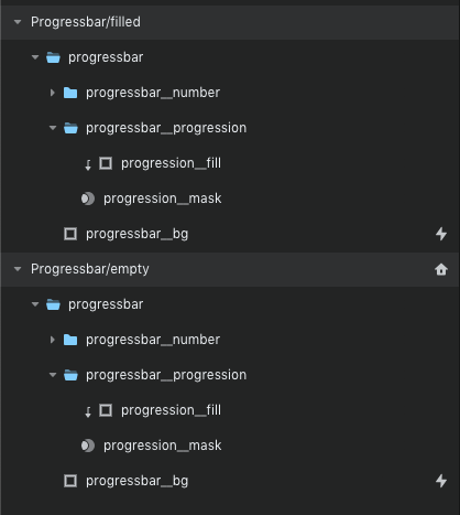
Layers: consistent naming further simplifies the animation process
Now we need to connect these artboards and make the transition come alive. To achieve this we need to;
a) enable a trigger to switch between the artboards and
b) let InVision Studio know we want the relevant layers to animate
For the sake of simplicity we'll make a click on the empty progress bar fire the transition to the filled progress bar. To make this connection we need to select any visible (and therefore clickable) element and click the plus icon next to [Interactions]. I selected the group object which has the fill and the mask.
The [trigger] property defaults to [click] which we'll use here and then set the [navigate to] to be the desired artboard - [Progressbar/filled] in my case. Next up is the magical part (if you've stayed consistent with the naming); set [transition] to use [motion] and the [duration] to your preferences. I'll use [2 seconds] for demo purposes.
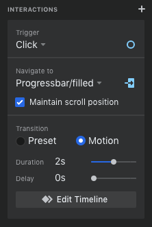
Interactions: the settings I'm using for the interaction
And that's it! We've successfully enabled an animated transition for the progress bar from 0% to 100%. Play the prototype and click the progress bar to see the transition.
As mentioned above, we can also use the position variable in our animations. This way we can simulate a progressive counter for the percentage. By adding a few text elements and a mask we can start with 0% visible inside the mask and in the second artboard we set a negative Y position for each text element which makes it look like it's scrolling.
![]()
The final transition result
When combining the above to animate size, position and transparency you can effectively display what would happen when opening a modal or expanding a card.
![]()
Animated transition of a modal expansion on click
What I've been meaning to convey through this post is that by using animated transitions we can eliminate misunderstanding how designs are to transition between views or events, thus minimizing the risk of an implementation not reflecting the intended design. If simplifying the communication between designers and developers isn't enough of an argument, we also achieve a more fluid and realistic prototype when presenting for stakeholders.
If you're interested to hear more about why animations in transitions are useful or just want to discuss the topic, feel free to reach out to me or you can contact us.
InVision Studio can be found at invisionapp.com.
