Testing visitors' click behavior

Denna artikel har migrerats från en tidigare version av vår webbplats och kan därför avvika i utseende och funktionalitet.

Den här artikeln är inte översatt till svenska och visas därför på engelska istället.


A client contacted me with concerns that the contact information on their site might be difficult to find. To eliminate guesswork I decided to set up a test to determine where visitors actually expected to find it.

Uppskattad lästid : 4 minuter

Gå till avsnitt

Community-driven usability testing

There are many different techniques, communities and software one can use to test website interaction design. Using a community is great when testing largers sites that cannot be updated ad hoc.

This time I choose to use usabilityhub.com which enables testing of mockups and designs before any code is written.

Constructing the usability test

The start page had three pieces of content relating to contact information, so I decided to determine which one was predominantly used. I set up the test like the following:

  1. The community was asked the question: "Where would you click to get to more information on how to get in contact?"
  2. Each test participant was then shown a screenshot of the start page
  3. Each participant were able to click up to 3 times to indicate where it expected to find the contact information
  4. The results were consolidated into a heatmap, showing the number of clicks and how long it took before each click was made (to let us know in which order the different sections were clicked)

Screenshot shown

Resulting heat map

Conclusions from the click testing

  • The main menu alternative Contact is the fastest and easiest way for a visitor to find contact information.
  • The second-most clicked item was the Find out more button, the start page's main call-to-action element, even though that button didn't actually lead to any contact information.
  • The third most popular result was clicking on the the phone number in the top navigation bar.
  • Lastly, the Get in Touch block was an alternative that took a long time for the participants to find.

Acting on the results

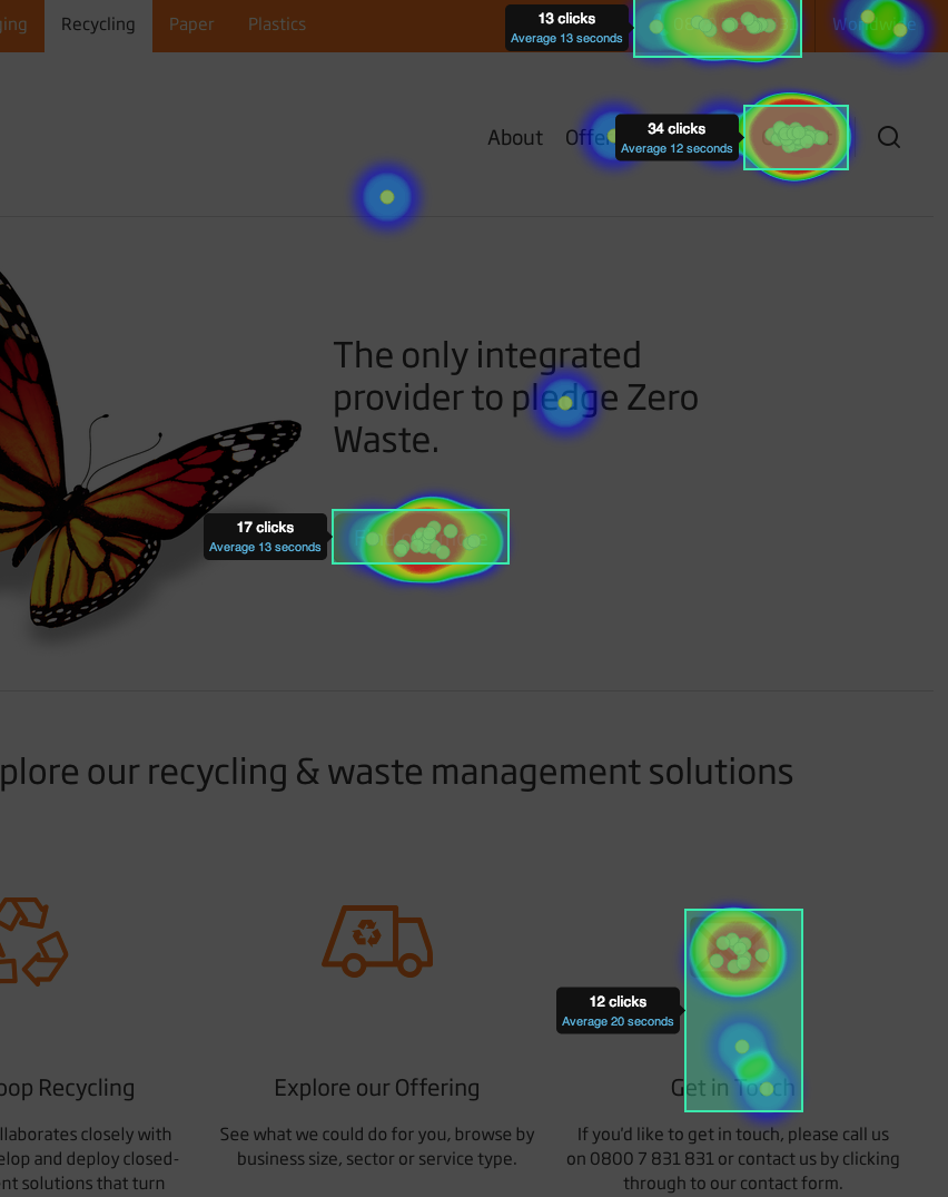
With this information we could advise our customers on the following developments and content changes to improve their customers experience:

  1. The Find out more button should lead to some contact information.
  2. Participants and visitors expect more information when clicking on the phone number, which at that moment was not a link at all. We recommend linking it to a contact form, in case visitors prefer an alternative to a phone call.
  3. We also suggest to remove the Get in Touch block as this distracts visitors more than helping them.

Summary

Testing reduces the guess work in interaction and information design. In this case we could discuss the result with our client and together make decisions for improving their customers' experience.