
This post aims to explain the basics of each of these concepts and discuss the differences and in what situations each concept is most useful. Thus it might be useful if you're just starting out in the field of UX/UI or if you have a client role and want to get a better understanding of what to expect.
As a final note before we dig into these terms I just want to point out that user research is a major part of UX/UI design and should be prioritized accordingly. However, that's a topic that won't be included in this article, but should be kept in mind.
Starting with the basics
Let's begin with a brief description of each term.
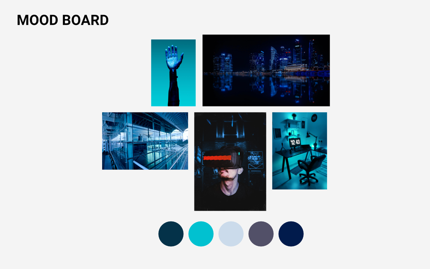
Mood board
The concept of mood boards has been around for a very long time and is used in all sorts of projects where design has a key role. The point of a mood board is to collect elements of inspiration in terms of color, shapes, patterns and meaning. In other words, the look and feel of whatever you intend to design. To further convey the tone and direction you can add quotes or certain phrases if an image can't properly capture the feeling.
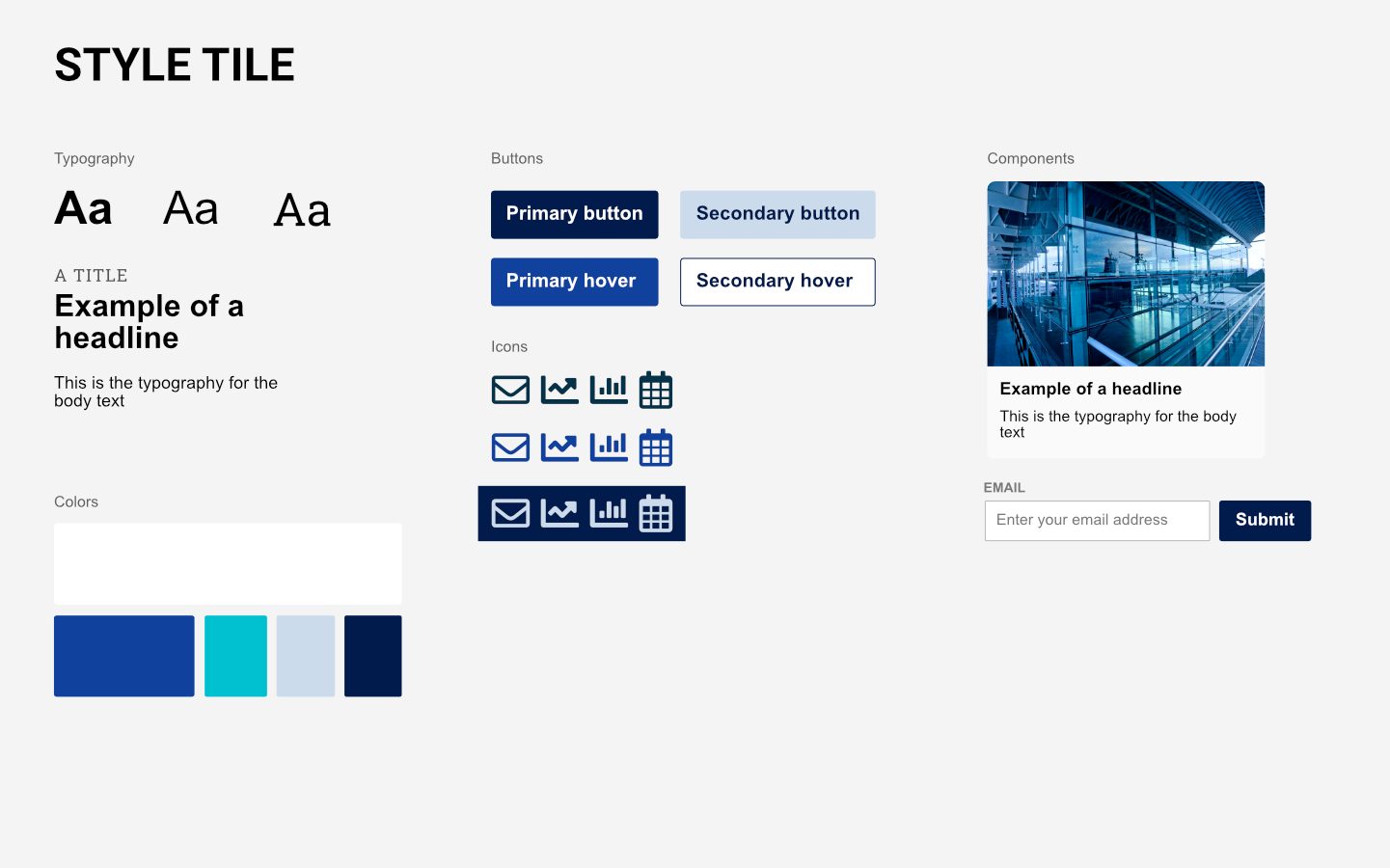
Style tile
A style tile is in some ways like an upgraded mood board. In a style tile we include (suggestions for) typography, color schemes and a number of graphical elements such as text compositions, icons, illustrations and buttons. As such, a style tile is used to set the visual language for the web representation of the brand.
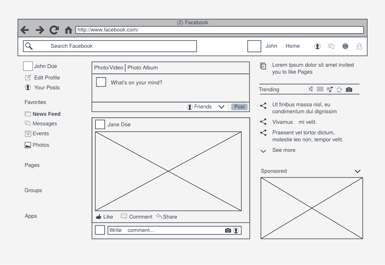
Wireframe
While the previous two terms are more graphical in their nature, wireframes are necessarily not. In essence, wireframes are the blueprints of a design. The skeleton, if you will. They're more or less rough sketches of our end product.
To make the matter somewhat more complicated, wireframes can be created in variating degree of fidelity, most often referred to as high fidelity (hi-fi) or low fidelity (lo-fi). By fidelity we mean the degree of confidence as to how close to the final design we're intending to make it. Hi-fi wireframes are closer to the final design than lo-fi wireframes, in terms of graphical completion, hence there is a high degree of confidence in hi-fi wireframes.
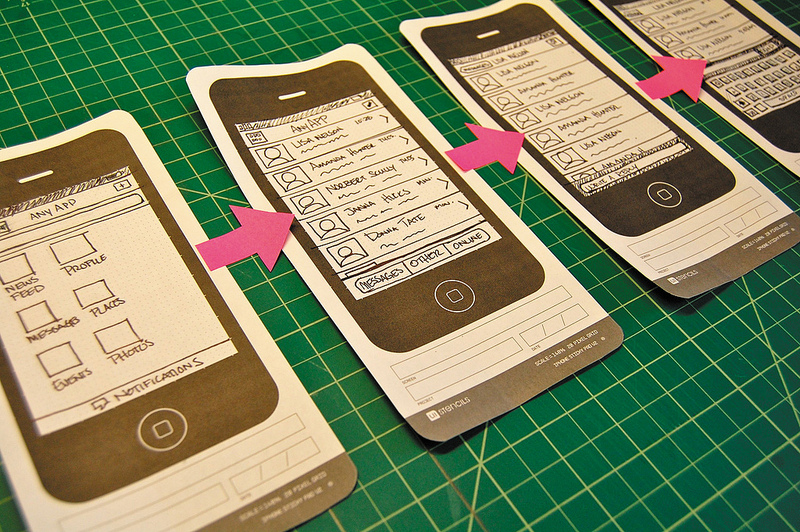
Prototype
Often similar to wireframes, but not necessarily limited to the same characteristics. The term prototype is used quite liberally, but I prefer to see it as an interactive experience, be it wireframes or a completely finished design. By "interactive experience" I mean that the prototype is navigable and you can interactive with different elements within it. This may be done in digital form as well as cut out printed or drawn sketches. This is for the purpose of getting a sense of what the actual user experience would be like.
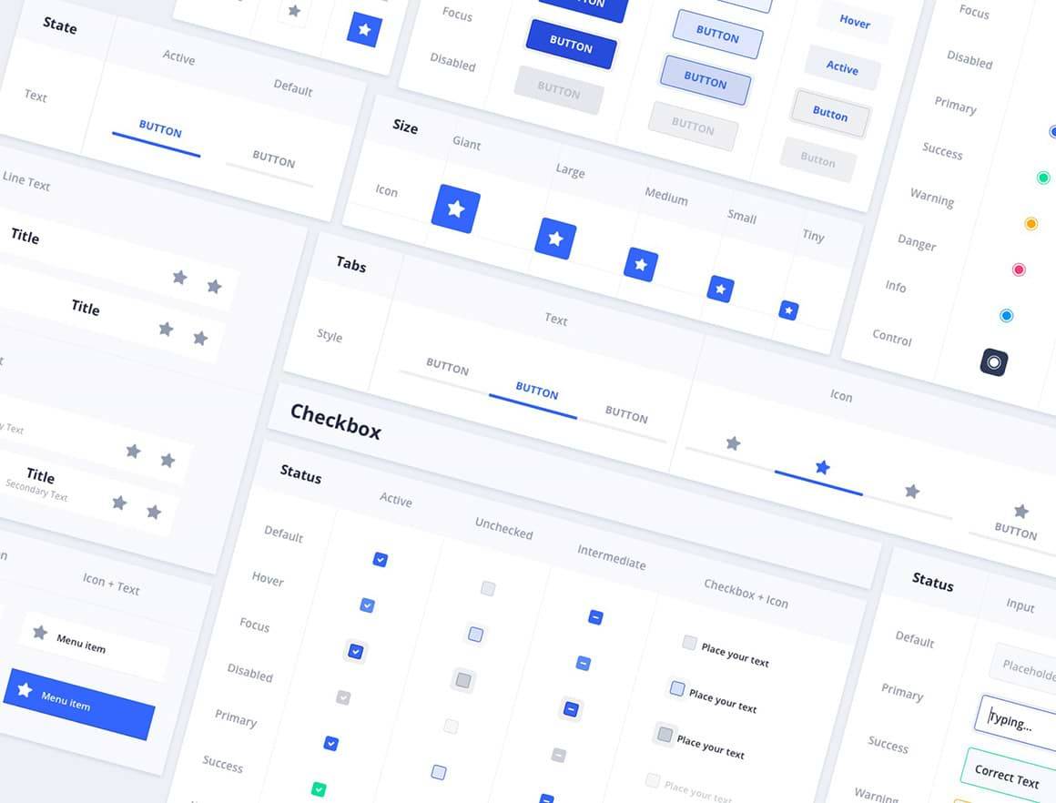
Design system
A design system contains all the necessary parts of a design as an overview of the design eco-system. This helps with consistency and making it easier to develop and reuse. It's reminiscent of a style tile, but much more complex and comprehensive. It's commonly used as a technical resource where guidelines are written on how, where and when to use the components. Thus it's usually a collaboration between UX/UI designers and developers.
The scope can vary from one design system to another, but a fully developed one does not only contain the design components, but also typography specifications, usage patterns, best practices as well as functional and technical documentation such as tonality and implementation guidelines.
Usage of each deliverable
You might not use all of these deliverables in the same project, since some of them overlap. But for the sake of explaining their usage I'll go through them as close to a chronological order as possible.
How you start a project can vary. Sometimes you need to start more abstract and work your way towards the user journey. Other times you have a clear understanding of the direction and want to start laying out the user journey first. In the first case I would start with a mood board while in the latter I would initiate the wireframing process.
We usually start off with some lo-fi wireframes to set the fundamentals of the design. Something rudimentary, so it's quick and easy. We layout some predefined elements and components to prioritize information and functionality and we run through the most common tasks to identify possible usability issues. This is done to save time later in the design phase, when everything becomes more detailed.
After drawing the wireframes for a few of the most common tasks or user journeys, we can turn it into a prototype. Many softwares used for wireframes these days allow for us to easily connect one wireframe to one or several others, depending on where we click. By doing so we've created an interactive prototype.
Before starting any UI design work we like to host a mood board workshop with the client to get input on the likes and dislikes, the target groups and the general feel they want to offer the users. How specific this needs to be usually depends on whether the client has a brand guide and if so, how detailed it is. This exercise acts as a bridge between us and the client to align our vision, set a direction and provide some inspiration.
Once we're set on a look and feel, we can dig into some more details and expand upon it. With the style tile we can present how different typefaces, colors, shapes and images work together, regardless of if it's from a brand guide or if we're free to make suggestions. Taking it further, we can include examples of how icons, illustrations, buttons or other smaller components could be visualized.
Design systems are their own eco system and can - and should - be an ever-living organism. It may or may not be initially developed during a specific project, but once you have a design system in place, you should carefully nurture it and over time iterate its contents.
Conclusion
The terminology of UX/UI may be confusing to people outside of the field and I hope I've cleared that up a bit with this post. While there are many deliverables that can be included in a project, all may not be needed every time. Fundamentally, the goal of the UX/UI process is above all to identify the users' challenges and how to improve on them.
Need any help or want to discuss UX/UI with us?
If you're interested to hear more about us, want to work with us or just want to have a conversation about UX/UI or any of our other fields, feel free to reach out to me or my colleagues.